
Content built around how split keyboards are used and the workspaces they fit, presenting the hero product through its design, colorways and purchase options.
Split keyboards are an unfamiliar category for most people, whose biggest worry is that they’ll feel awkward and require relearning how to type. With only one core product, the brand needed a single page that explains why to use a split keyboard and what makes this one different, then guides visitors smoothly to purchase.
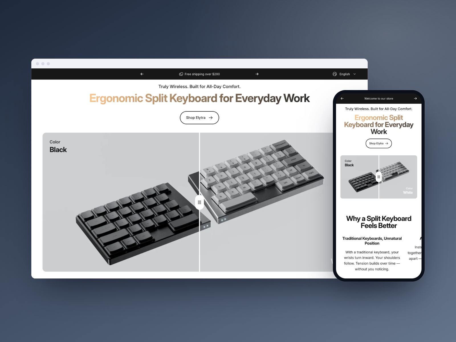
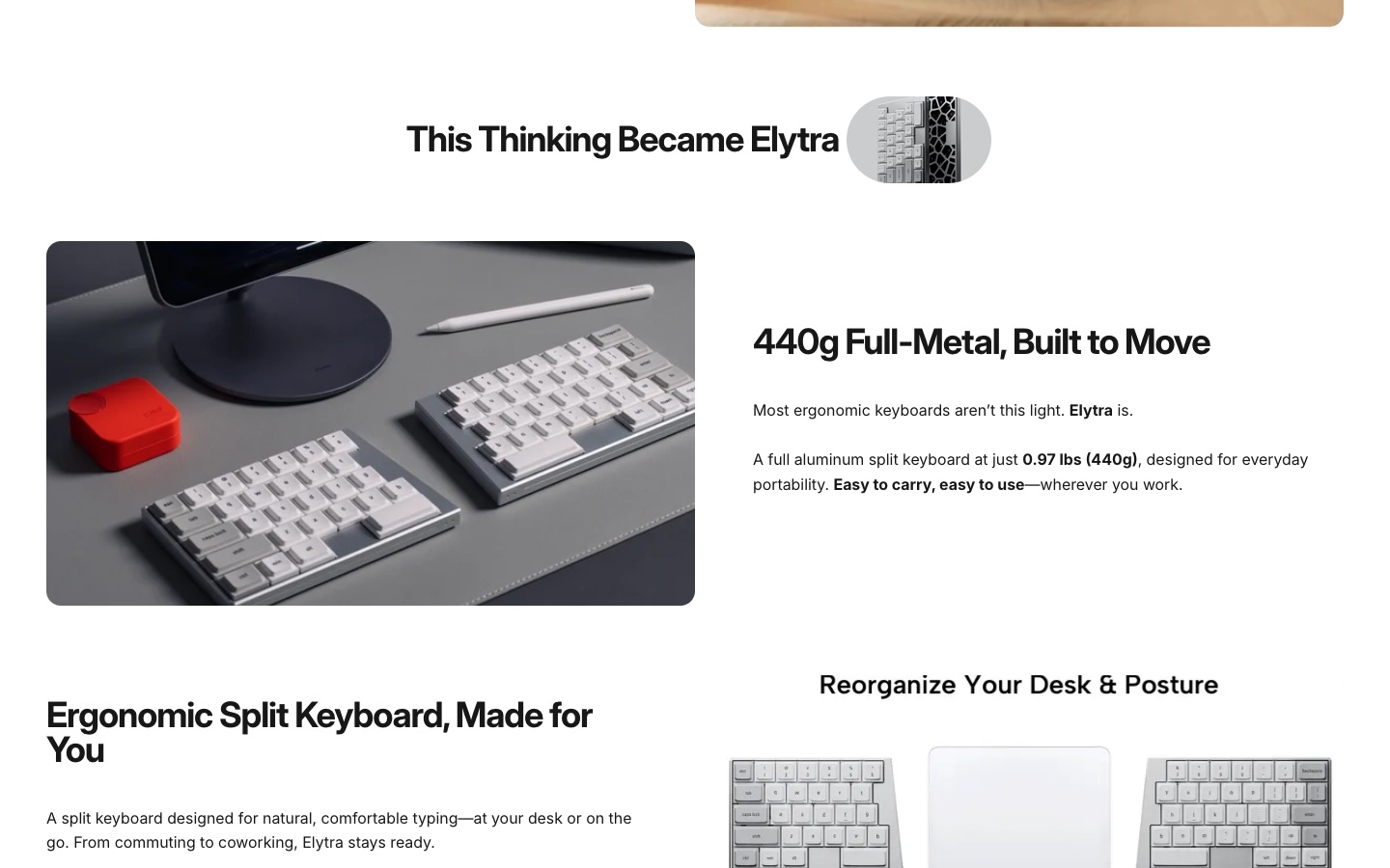
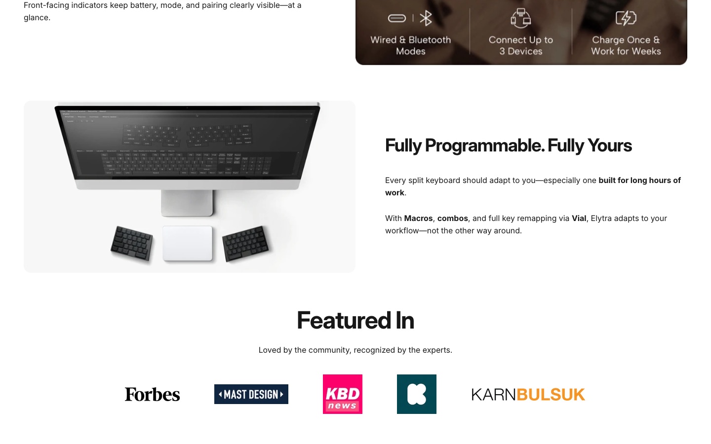
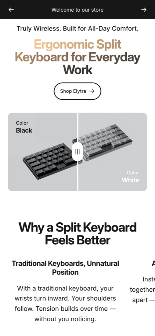
The homepage unfolds in order: why split is more comfortable → why we made this keyboard → product highlights → media and customer reviews → FAQ. It tackles awareness first, then covers selling points such as the 440g all-metal body, dual-mode connectivity and programmability. A slider compares the black and white colorways side by side, accessories, keycaps and switches are grouped in the navigation, and firmware updates and user guides sit in the support section.
- Brand website design and build
- Ergonomic use case explainer
- Core product and colorway showcase
- Press coverage and customer reviews
- Accessories and support center
- FAQ and email sign-up
The finished brand site includes the product story and ergonomics explainer, a black and white colorway comparison, core selling point modules, press coverage and customer reviews, an FAQ, accessories and add-ons, firmware updates and user guides, plus a language switcher and sign-up. Sign-off focused on a clear add-to-cart path for the flagship product and complete mobile layouts for every module.
Have a similar project?
Tell us about your business, your current site and what you want to improve. We reply within 1 business day.